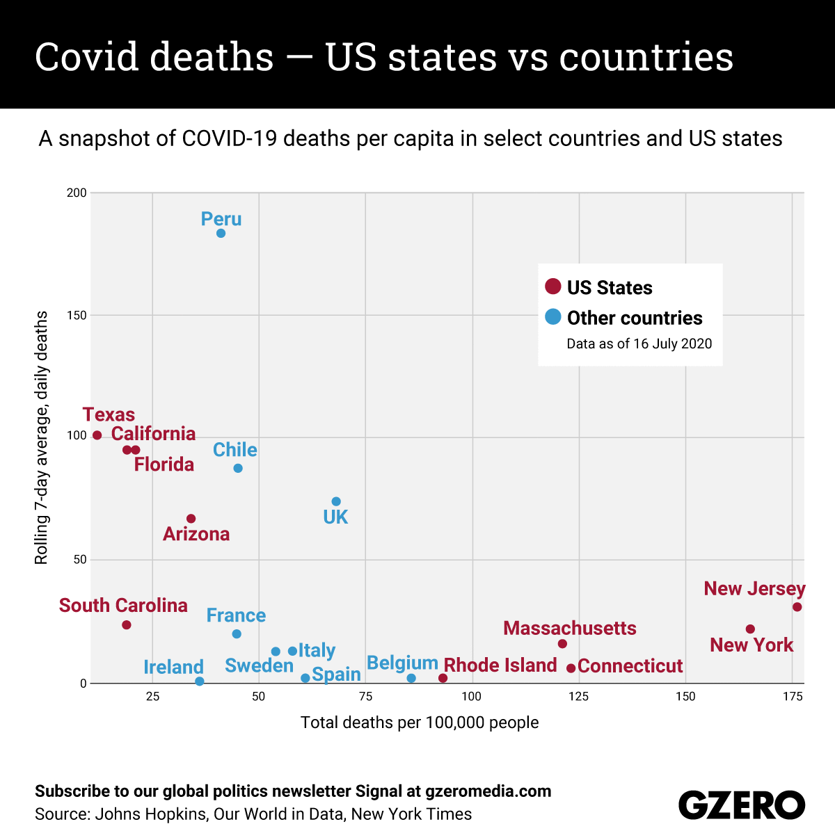
Back in March and April, the most severe COVID-19 outbreaks were in Europe — specifically Italy, Spain, and France — as well as the Northeastern United States. In the months since, these areas have managed to flatten their curves through strict social distancing policies, but now the epicenter of the coronavirus in the US has shifted to some Southern states that resisted lockdown measures. Consider that the United States recorded an average of 744 COVID deaths in the seven days leading up to July 16, compared to 74 in the UK and 13 in Italy during that same period. Meanwhile, Latin American countries are now also facing some of the biggest outbreaks in the world. Here's a look at where COVID-19 deaths are rising fastest, broken out as a comparison between US states and other hard-hit countries.
Editor's note: An earlier version of this graphic mistakenly labeled the y-axis as rolling 7-day average of deaths per 100,000 people. In fact, the y-axis refers to the rolling 7-day average in deaths from the coronavirus (not per 100,000 people). We regret the error.